Background
The Coronavirus (COVID-19) in the UK Dashboard is the official UK government website for data on COVID-19. The pandemic is constantly changing, so to help people make quick decisions we are producing the data at pace. The dashboard isn’t formally badged as official statistics (due to, for example, the need for a speedy turnover and ministerial involvement in decision making), but it does meet many of the official statistics criteria, so we decided to voluntarily apply the Code of Practice for Statistics.
This signals that our statistics meet the 3 ‘pillars’ of the Code:
- they have public value
- they are high quality
- they are trustworthy
In this case study we focus on the value pillar, which states that statistics and data should:
- be useful
- be easy to access
- remain relevant
- support understanding of important issues
The five principles of the ‘Value’ pillar are:
- Relevance to users
- Accessibility
- Clarity and insight
- Innovation and improvement
- Efficiency and proportionality
Benefits of applying the code
Applying the code voluntarily shows our commitment to transparency and our desire to increase user trust in the dashboard. Our published statement of compliance helps users to understand the processes involved. Its application not only benefits users, but also helps us as producers to demonstrate what we are doing well and identify areas for improvement.
Available and well used by all
The dashboard is extremely well-used, with:
- 1 million unique users per day, on average
- up to 70 million daily hits
Peak time for use is 4pm when the dashboard is updated. There can be around:
- 30,000 concurrent hits per minute right before 4pm
- 250,000 to 300,000 per minute as soon as the data are released
We make as much data available on the dashboard as possible, without compromising quality or confidentiality. Our API and data download options allow people to use the data for their own purposes. Again this is highly popular, with downloads averaging around 1.3 million per day.
We want the dashboard to be accessible to as many users as possible. It is simple to use, helping anyone to navigate the data and visualise trends over time and across geographic regions. We commissioned an accessibility audit in July 2020 and provide a full accessibility statement on the dashboard. For example, users can:
- read simple summaries of the data
- access data in a variety of formats. The dashboard has many visual elements, but all data is also provided in text form.
We continually seek to improve functionality and make sure we comply with the Web Content Accessibility Guidelines version 2.1 AA standard. We list non-compliances for transparency, and, where possible, explain how we will fix these or why we don’t comply.
Innovative and continually improving
We want to provide the most reliable statistics and ensure the best user experience possible. We always seek user feedback to help us develop and improve the dashboard. We collect this via:
- individual research sessions, with over 100 conducted to date
- emails to our feedback mailbox, which is monitored daily and receives many hundreds of email each week
- a programme of regular user surveys. The latest had over 38,000 responses. Our next survey will be in early 2022
- analytics, for example, to find out which parts of the site are most popular
Feedback helps us to improve data presentation to make sure it is easy to understand and meets the needs of different users. In response to user feedback, in 2022 we plan to research and improve how people experience the site on mobile devices.
Changing the dashboard to meet the needs of the pandemic – home page comparison
As the pandemic continues to evolve, user interests and needs also change. We constantly reassess our data and design to meet these shifting requirements. For example, in mid-2020 there was high interest in testing capacity, so test data was prominent on the dashboard. However, interest has now shifted and is more focused on the vaccination programme (in particular boosters since the emergence of the Omicron variant). To meet this changing need, we have made vaccinations more prominent, and expanded our data to include trends, maps and local data (via postcode search functionality). We are also in constant collaboration with devolved administrations to improve the extent of UK-wide data.
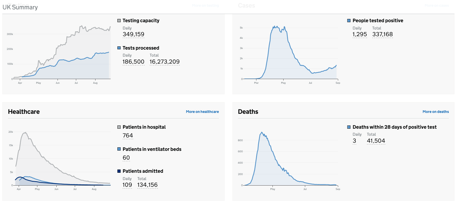
August 2020: Tests prominent, no postcode search for local data, figures for whole pandemic, no trends.
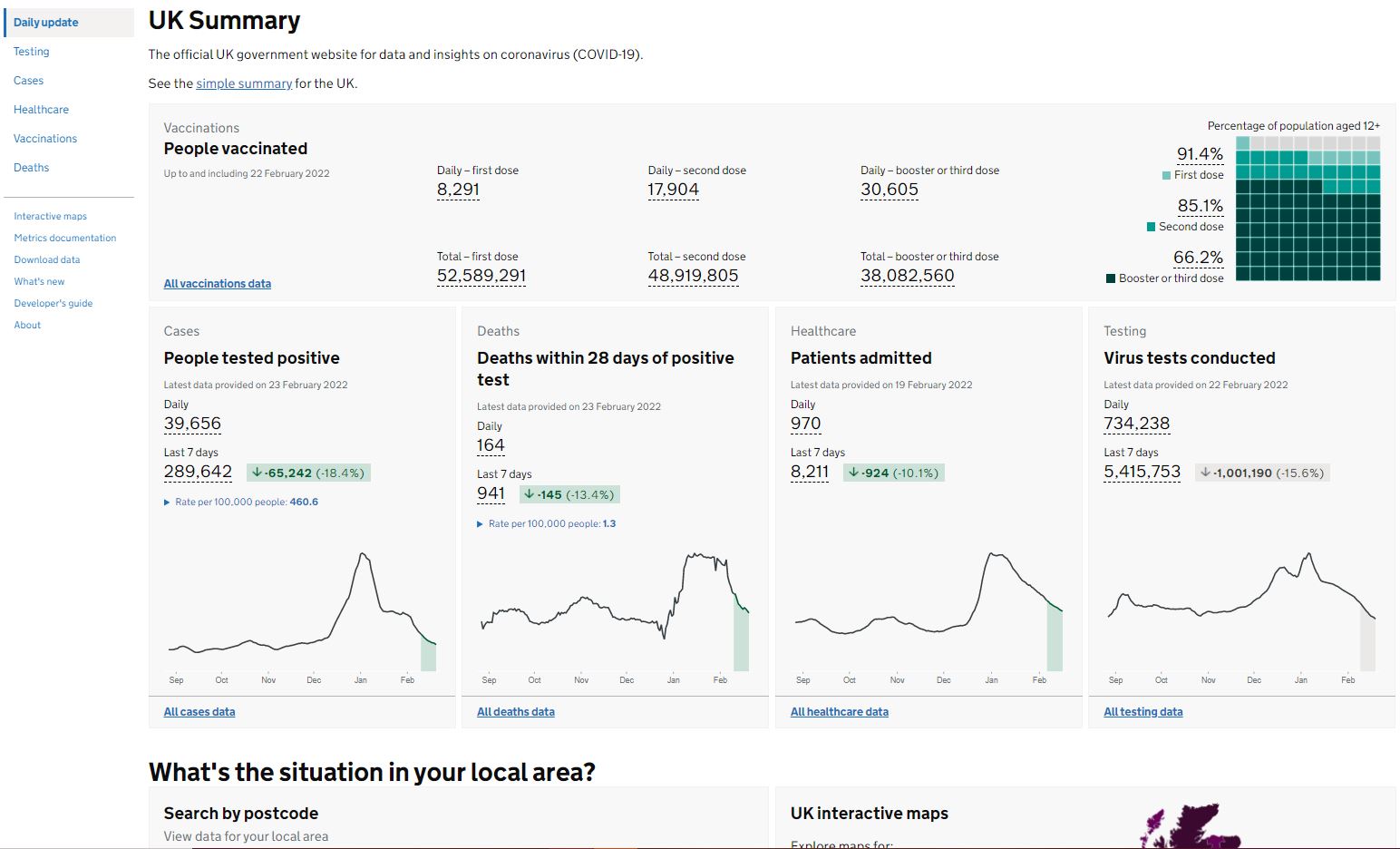
February 2022: Vaccinations prominent, postcode search for local data added, tests moved down the page, trends added: shown with figures, arrows and colour.
Meeting different user needs
We present data in a variety of ways to suit different users and help aid understanding. This means the data are of value to people looking at it both for personal interest (around 89% of our audience) and for professional reasons.
We provide:
- visualisations, including graphs, maps (choropleths), and arrows to indicate trends
- simple headline figures in web and PDF formats
- full data tables
- data downloads in 4 different formats (CSV, JSON, JSONL, and XML)
- multiple Application Programming Interfaces (APIs)
- supplementary downloads, such as population denominators
We provide data and metadata at the greatest level of detail possible for those who need it, and simpler overviews for users who need less detail, with explanations provided in plain English.
Open, efficient and technologically advanced
We are open and transparent about dashboard developments and any issues that occur. You can find details on the latest updates, changes and data issues on the ‘What’s new’ pages. Some of the more recent additions to the dashboard are:
- virus tests (all virus tests and lab-based virus tests) by specimen date added for England plus regions and local authorities
- age breakdowns and local data added for booster or 3rd dose vaccinations
- new metrics documentation page listing all current and historical metrics (searchable by name, category, type or availability by area type)
We strive to make our work ‘low burden, high benefit’. For example, we use existing datasets and add value to collections that have been stood up for COVID (for example, hospital data) by reusing the data and presenting it to the public. We use leading edge technology and data pipelining from numerous data sources.
Value means more than just the number of people viewing the dashboard. We know this data is of huge public interest, but we also want to make sure we are presenting it as clearly and accurately as possible. We use rigorous statistical and design processes to make sure we are giving people the information they need in a way they can easily interpret. We engage with the people who use the dashboard as much as possible, to make sure we are not making assumptions and that we’re addressing their changing concerns in this fast-moving landscape.
We want our Dashboard to be valued by all users. Applying the Code pillars allows us to feel confident that our work is easy to access, remains relevant, and supports understanding of important issues in relation to COVID-19. The trust we have built is evident in the volume of use and overall popularity. As the pandemic evolves our Dashboard will also change, but what will remain constant is our willingness to ensure our statistics meet the Code.